
Listening in Motion is a series of motion pieces created to support a podcast exploring emerging topics around AI, technology and their practical use.
The project focuses on translating spoken conversations into a visual layer that helps organize ideas, highlight key moments and support understanding — without distracting from the audio itself. Rather than leading the experience, motion works alongside the voice, following its rhythm and reinforcing meaning.
The goal was to translate tone, pacing and storytelling into visuals — creating motion pieces that feel present, restrained and aligned with the act of listening. Motion graphics and design were used not as decoration, but as a narrative tool to make complex topics feel clearer and more approachable.
Concept
At the time this project was developed, AI was just starting to gain wider attention, generating a lot of information, opinions and uncertainty.
Since the podcast focused on presenting AI as a tool rather than a replacement, the visual direction needed to follow the narrative closely — supporting clarity, reducing noise and reinforcing the idea of AI as something approachable and understandable.
The concept was to visually accompany the conversation, letting the audio lead while motion helped organize ideas and guide attention.

Visual decisions
Visual decisions were driven by accessibility, continuity and tone.
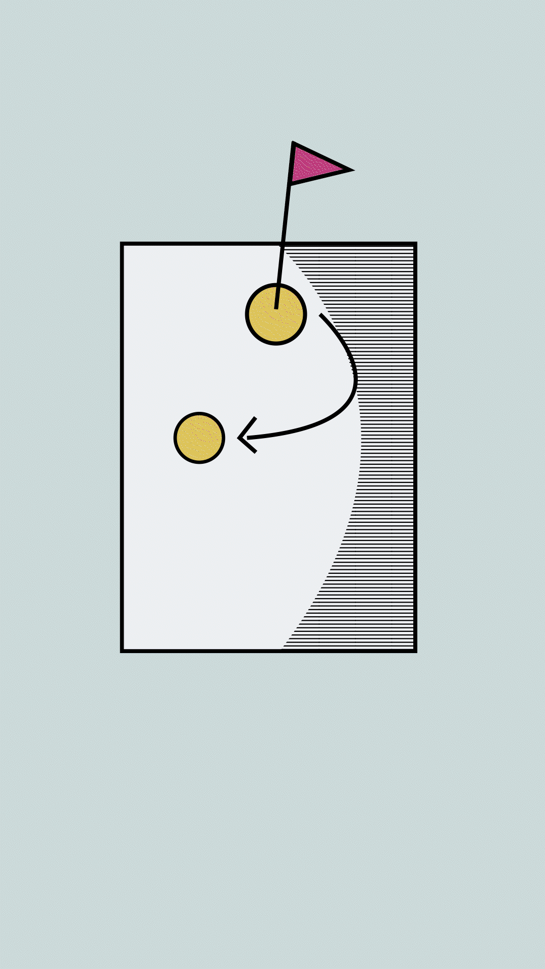
AI concepts were represented through friendly robot characters, avoiding cold or overly technical imagery. Each AI was assigned its own robot, which continued across different videos to create familiarity and recognition over time.
This recurring visual system helped build coherence throughout the series, making complex topics feel more personal and less abstract, while maintaining a consistent visual language across episodes.
Storytelling
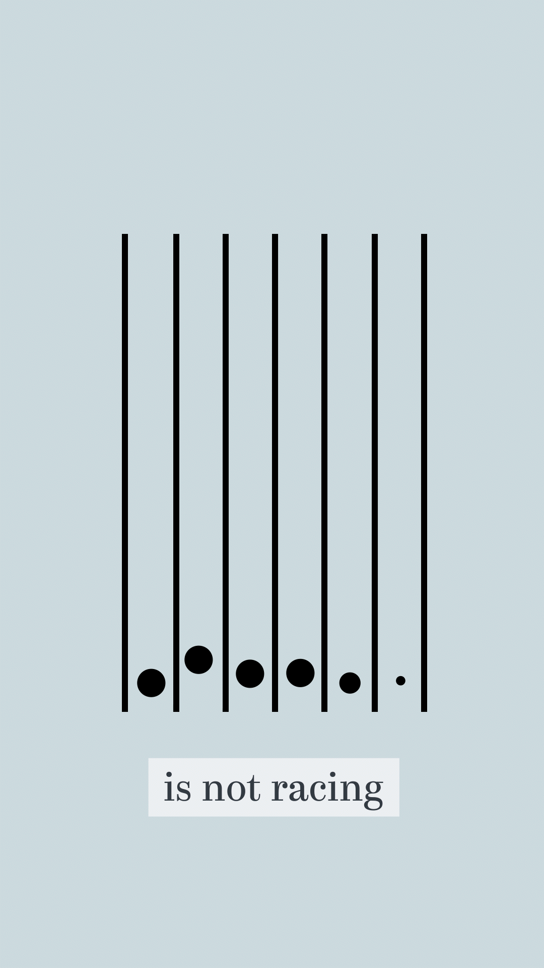
Storytelling was built primarily through transitions.
Transitions acted as the main narrative device, allowing visuals to follow the rhythm of the audio rather than interrupt it. Movement between scenes was designed to feel fluid and intentional, reinforcing the sense that images were responding to the conversation as it unfolded.
This approach helped keep the focus on listening, while still offering a visual layer that supported understanding and engagement.
Outcome
Each video reached at least 1K views, expanding the podcast’s visual presence and helping it connect with a broader audience.
The project demonstrates how motion can amplify audio content — not by competing with it, but by enhancing its clarity, rhythm and impact.